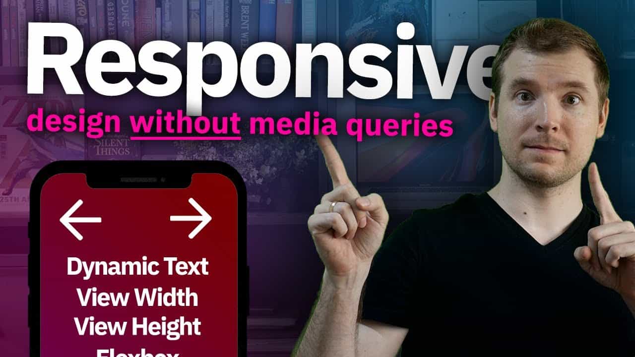
Responsive Web Design Without Media Queries can be done in a number of ways.
This video will take a look at using CSS and HTML without using @media to create responsive websites that dynamically update. Media queries can add extra layers of complexity and difficulty to a website. By only using CSS and properties such as view width and view height, we can resize things like font size to stay consistent for any device size. We can also use flexbox to create flex containers that always fit the size of the device. On top of that, there are cool properties like flex-wrap that allow you to wrap containers if they overflow within their parent. Hopefully, these programming techniques help you design better UX website designs that will make your web programming easier in the future 🙂
#responsivewebdesign #mediaqueries #adriantwarog
Follow and support me:
Patreon: https://www.patreon.com/adriantwarog
Twitter: https://twitter.com/adrian_twarog
Dev.to: https://dev.to/adriantwarog
source

