Do It Yourself – Website Tutorials
Just getting started with Squarespace CSS? Awesome! 😍 I want to teach you the basics – grab my free Getting Started Guide here 👉 http://bit.ly/guide-to-css
—
This tutorial is specifically for Squarespace version 7.1
If you are using version 7, check out this tutorial for info on how to create this same effect in a summary block: https://youtu.be/yZbNN5ysUws
Aaaaand if you have no idea what version you are using, find out here: https://insidethesquare.co/theme-families
—
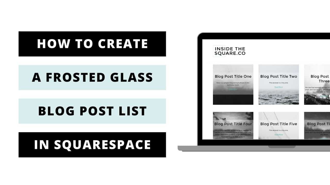
This tutorial will show you how to create a frosted glass effect for the blog grid in your Squarespace 7.1 site. A few important things to note before you copy and paste this into your own site:
+ There is more than one way to do this! This is just one approach of many because code is super customizable.
+ Be sure to edit the code to suit your own site style, trying different blur options, adjust those margins, padding, and more.
+ This code is specifically for Squarespace 7.1 blog post pages.
+ You can apply this to a single page using page header code injection or an on page code block. Check out this tutorial for more info on that: https://youtu.be/kX6kRjCbzu8
+ If you need some help with this tutorial, feel free to contact me at https://insidethesquare.co/code-help
→ Here is the basic code from the tutorial:
.blog-basic-grid .blog-basic-grid–text { position: absolute; background: inherit; margin-left:5%; margin-right:auto; width: 90%; height: 70%; margin-top: 12.5%; background-color: rgba(255, 255, 255, .3); backdrop-filter: blur(5px); border-radius: 10px; }
.blog-basic-grid–text *{padding: 0 .2rem 0 .2rem}
→ And here is the hover effect version for desktop only:
.blog-basic-grid .blog-basic-grid–text {
position: absolute; background: inherit; margin-left:5%; margin-right:auto; width: 90%; height: 70%; margin-top: 12.5%; background-color: rgba(255, 255, 255, .3); backdrop-filter: blur(5px); border-radius: 10px; transition:2s; }
.blog-basic-grid–text *{padding: 0 .2rem 0 .2rem}
@media only screen and (min-width:640px){
.blog-basic-grid–text:hover{
backdrop-filter: blur(0px); background-color: rgba(255, 255, 255, .5); }
.blog-basic-grid–container:hover {
box-shadow:5px 5px 10px #ccc; transition:1s}
.blog-article-spacer{display:none}}
▸▸▸ Ready for more codes?
The codes in this tutorial are just the beginning of all the cool things you can do with Custom CSS! When you’re ready to dive in and start customizing, you can use codes from my CSS Cheat Sheet. It has over 30 pages of code snippets and pro tips to help you get started. Download your copy at https://InsideTheSquare.co/css
—
#squarespace #squarespacecss #howto #customizesquarespace #css #squarespacetricks #squarespacehacks
The term “Squarespace” is a trademark of Squarespace, Inc. I am not affiliated with Squarespace, Inc. I just really love their platform.
source

