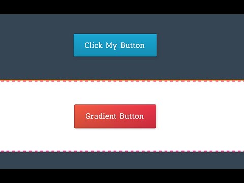
Final result: https://dribbble.com/shots/2883635-Lickable-3D-CSS-Buttons
Follow along yourself: http://oxygenapp.com/try
Steve Jobs famously said “We made the buttons on the screen look so good you’ll want to lick them” when describing Mac OS X’s Aqua user interface. Steve Jobs would lick these buttons, but Jony Ive might puke. Too bad.
A wise man once said that flat UI is for wannabe designers that lack visual chops 😛
Too lazy to make these yourself? You can find these buttons in the “Video Tutorials” Design Set. Just go to Add+, Design Sets, Video Tutorials and then look for the “3D Lickable Buttons” component.
I didn’t show it in the video, but to make these buttons look even better, add a shadow that shows up outside the button 2 pixels to the left and 2 pixels from the top, with 5 pixels of blur, that’s black with 10% opacity. Code for that would be to add a comma and then 2px 2px 5px rgba(0,0,0,0.1); to the end of your box-shadow line. This will make them pop out a bit more.
source

